MiPortal: Digital customer self-service portal
5 Months From Aug – Dec 2025
Type
Utilities, Mobile, Design System
Role
Lead Product Designer
Company

Avertra Corp
Status
" height="12px" id="VzNLXIFlr" width="12px"/></svg>)
As part of the Avertra team, I contributed to 80% drop in call volume, and a 60% reduction in user process times
Goals
Lead Product Designer responsible for end-to-end UX/UI and Design System architecture.
Decrease high operational costs by reducing call center traffic.
Create a unified experience that handles both Residential and Commercial property management.
Results
Contributed to a 80% decrease in call center volume.
Reduced the total process time for end-users by over 60%.
Results from usability testing that increases user satisfaction rate over 50%
Overview
MiPortal is a self-service portal built to handle the needs of utility customers at scale. It gives people full control over their accounts so they do not have to rely on traditional support models that are often slow and expensive.
MiPortal consists of two primary user personas (for this specific project):
Residential
Simple, account-based management for single properties.
Commercial
Dashboards and bulk-action capabilities across massive properties.
Context & Challenge
The Challenge: The utility experience was difficult for everyone involved. Customers could not find answers easily and felt frustrated by unclear steps and that they need too many follow ups.
At the same time, agents were stuck using slow tools while dealing with endless calls and messages. These bottlenecks made it hard to solve problems quickly or keep up with what customers expected.
What customers are facing:
What they actually need:
Create a unified self-service portal that:
Is easy to navigate and find what you’re looking for
Finds answers for questions without many follow-ups
Builds confidence by providing feedback and communactions
Reduces process time for services
I broke the project into three core pillars to solve these issues:
Usage Control: Users must be able to see billing trends and real-time consumption.
Quick Actions: Reporting an emergency like a gas leak should be a one tap process.
Dual Personas: Residential users manage accounts while businesses manage larger portfolios.
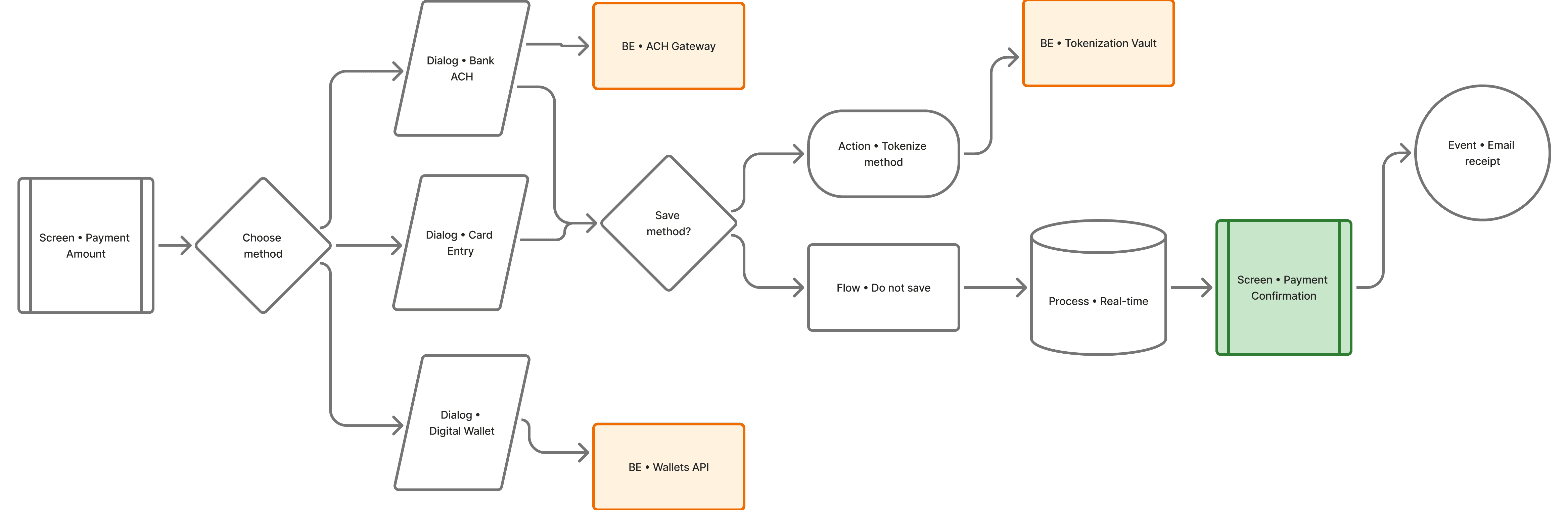
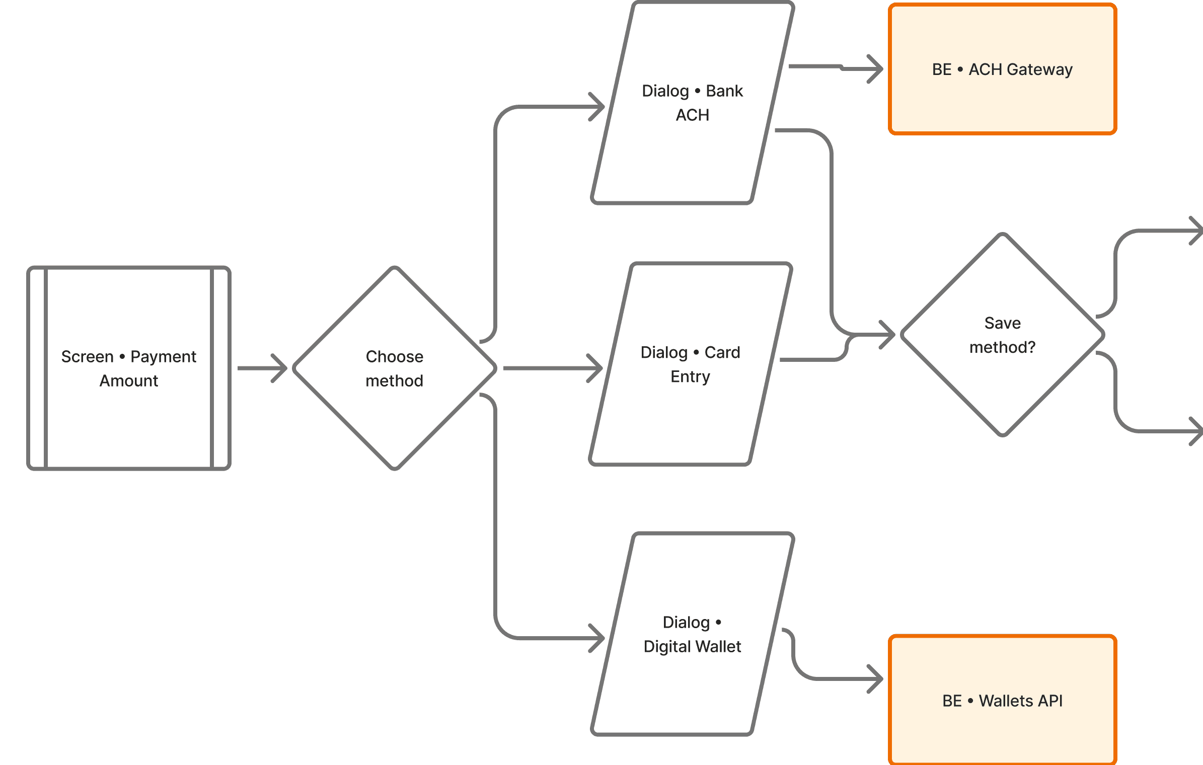
User Flow Diagram (1 out of 150 flows)
I have started with designing the flow diagrams to match the features we are designing based on the PRD. The projects consists of 10 epics for each persona (residential, commercial), and each epic consists of multiple features in the portal. Here's an example of one epic flows for "One-Time Payment" feature designed in FigJam.
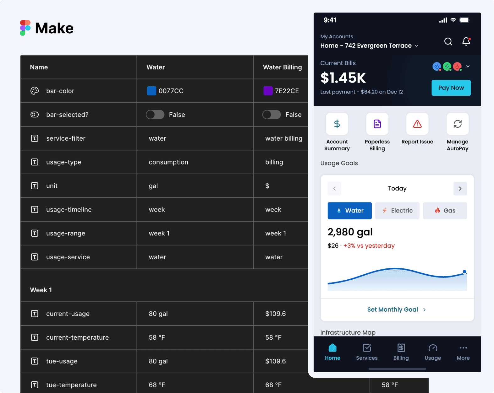
Rapid Prototyping (Vibe Coding)
I adopted a rapid prototyping approach called vibe coding to bridge the gap between complex business epics and a human experience. Using Figma Make and Avertra's Design System, I built functional models that allowed us to test complex logic in real time. This was essential for validating high density features like bulk reporting before moving into full design or development.
Logic Architecture over Static Pixels
Instead of using simple wires, I used conditional logic and variables to build a truly functional model. This allowed the team to smoke test the journey and identify details we did not think of before, such as how the system handles filtering and how components behave under different data states.
By testing these scenarios early, I could catch logic errors in the user journey before they reached the engineering team. This process ensured the app remained intuitive for millions of utility users while giving me a clear blueprint for the final variables and statements in Figma.
Showcase
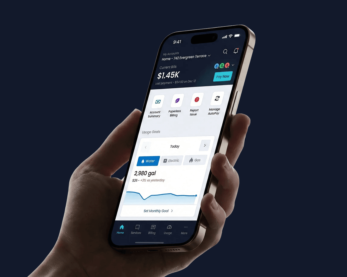
I designed these features to reduce the burden on call centers and give users total control over their accounts. From map based reporting to bulk payments, the focus was always on speed and clarity for millions of customers.
View an older version of the design system created for MiPortal with Documentation:
" height="19px" id="ieR3teqM1" width="11px"/></svg>)
" height="19px" id="B1hMLboTx" transform="translate(2 0)" width="11px"/></svg>)
Reflections
Designing for Scale and Complexity:
Working on MiPortal taught me how to manage extreme data density without losing the human touch. Building a system that handles three different utilities for millions of users required a shift from designing screens to designing scalable logic. This project reinforced my belief that great design is about how efficiently a product solves real world problems.
The Value of Functional Prototypes:
Using the vibe coding approach was a major turning point for this project. It proved that validating logic through functional models is much more effective than showing static designs. This process helped us catch errors early and kept everyone aligned on how the product should actually behave.
A Collaborative Effort:
The impressive results we saw were the result of a massive team effort. While the new UI and UX were key to reducing call volumes and process times, these wins were also made possible by the powerful SAP infrastructure and the engineering team at Avertra. I am proud to have contributed to these statistics as part of such a complex and capable ecosystem.
What Comes Next:
If I had more time I would explore more personalized predictive usage alerts to help customers save even more on their monthly bills. I want to continue building tools that turn complex data into simple and actionable insights for every user.